Just in time for Hallowe'en, a retail vampire has arisen. It's set up shop in the wastes of White City, sinking its teeth into the local economy and sucking dry the surrounding neighbourhood. Many's the innocent punter already lured deep into its clutches, their purchasing habits transformed, their conscience drawn over to the dark side. And the name of this merchandising monster is Westfield. London's lifeblood may never be the same again.
Oh my word, it's big. You get some sense of scale from outside, as if some vast aircraft hangar has been erected amongst the backstreets of Shepherd's Bush. But only from inside is it possible to take on board how huge the Westfield development really is. Just when you think there can't possibly be even more shops tucked away up some passageway, more appear. It's as if some ferocious tornado has whisked away the full length of Oxford Street and New Bond Street, lifting them three miles to the west and coiling each up beneath a vastundulatingglassroof. Lakeside and Bluewater may give you some idea of what to expect, but in truth London's seen nothing quite like this before. So long as anyone in town still has any money to spend, Westfield threatens retail domination.
I headed over to W12 just before sunset on opening day. The initial mad rush was over and the crowd control monkeys weren't having to be quite so heavy-handed in their funnelling. My southern approach was up a deep concrete canyon, with not-yet-open restaurants to one side and a long deep Waitrose on the other [photo]. Towering above was one of the four "anchor" department stores, this one a House of Fraser (Wood Lane approachees get Next first instead). Quite a trudge already, and still not yet inside the mall proper. Up that escalator, maybe, or through the main doors up ahead. Getting inside was easy, but leaving might prove rather harder.
Sheesh, big big big, busy busy busy. I'd stumbled on the main central atrium, a vast space where the glass roof appeared to be supported by an artificial frosty forest [photo]. Most of the mall's cafes and restaurants are based around here, and sometimes it was hard to avoid walking through their outer seating fringes. No fried burger takeaways here. The management want you to sit down to eat, partly because it adds an air of cultured refinement but mostly because you'll spend more. A pink-lit stage provided the entertainment focus, with a small crowd already gathered to await the quarter to six fashion show. I moved on quickly.
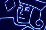
Turning right, I discovered the first of the 250-or-so stores to have opened their doors within Westfield's virgin portals. Most boasted smart glass frontage, two storeys high, revealing brightly-lit cavernous but thin interiors. These were no ordinary high street shops, these were a little more aspirational. Or, if I turned right again into TheVillage, a lot more aspirational. I can't ever imagine wanting to slip inside De Beers or Louis Vuitton or Versace, and I'm such a shopping pleb I'd never even heard of Daniel Hersheson or Fratelli Rossetti or Zadig & Voltaire. But I'm sure the well-heeled of nearby Holland Park will be super-chuffed to find such top-brand luxury on their doorstep, and they won't be the only upmarket purchasers to be drawn into Westfield's unashamedly luxurious web. The rest of us, we can just gawp at the pink chandeliers hanging from the ceiling like a shoal of alien jellyfish. [photo]
Enough gawping, and on with my tour of the upper mall. No, I'm not interested in shopping in there, or in that, or with them. I'm really not target audience for Westfield at all, am I? I'm the wrong gender for a start, and my fascination for showy accessories never really ignited. Instead I took a chance on the flagship Marks & Spencer, bypassing the lingerie and blouses to explore the store's food-based options. A small cafe out front allowed weary shoppers to sit fenced inside a curved corral and nibble M&S comestibles [photo]. Descending to the basement I entered an enormous supermarket, shelves fully stocked, but not yet rammed with discerning shoppers. Three fast-checkout till staff competed for my single purchase, then returned to gossip to pass the time. I exited across the cavernous underground car park, not yet busy enough to be a danger to short-cutting pedestrians. Saturday might be different, I suspect.
Back up in the main mall there were still three quarters of Westfield's shops to discover. On and on I trudged, down and round and up, negotiating the busy first day crowds [photo]. Half-term families were out in force, as were the local baseball-capped youth (who were especially interested in one particular window display boasting three pouting bikini-clad models). There were plenty of happy shoppers with carrier bags, although outnumbered by first day sightseers without carrier bags. At HMV a queue of excited Saturdays fans spilled out far along the concourse (Westfield will be big on 'event' shopping, I think). Thank goodness for Foyles, otherwise I might have wandered around forever without even the slightest flicker of interest in buying anything. Again the staff seemed under-busy, so heaven knows how tedious their lives will become once the initial rush wears off. Tuesday mornings in February, they're going to be the acid test of this building's long-term potential.
It took a while to notice, but Westfield has been arranged very carefully to separate out different classes of customer. The Shepherd's Bush corner with its jellyfish Village is for aspiring Mayfair types. The upper mall with its photogenic glass ceiling is for the middle classes with money to spend [photo]. And the lower mall, particularly in the Wood Lane corner, is for ordinary folk more used to High Street chains and bog standard outlets. You won't find a Disney Store or a Barratts upstairs, and you won't find a Habitat or a Crabtree & Evelyn down. Westfield is several different malls merged into one, because that way there's bound to be somewhere you'll feel at home.
After my circuit I headed back outside into the chilly damp October evening. How skilfully Westfield had made me forget about the world outside, a bit like a Las Vegas casino but without the garish tack. As I walked back along Restaurant Canyon there were still hordes of first-time visitors streaming the other way, keen to experience their Westfield debut. But I wanted to see the effect on Shepherd's Bush's original shopping mall, the desperately ordinary West 12 centre. Business was not brisk [photo]. Admittedly the place has been fading gently for years, but the paint shop, newsagents and pool hall weren't proving anywhere near as magnetic as their northern counterparts. Were it not for Morrisons at the rear, still by far the most affordable supermarket hereabouts, the place might have gone down the plughole already. And when Westfield's cinema opens next year, the Vue in West 12 may not be quite so successful at putting bums on seats.
I hope the shops and market stalls and cafes and restaurants around Shepherd's Bush Green survive the arrival of an over-sized cuckoo in their nest. They fully deserve to, because they're catering to an entirely different clientèle to Westfield's target footfall. Some of us need value more than pampering, and want personal service more than a personal shopper. And it would be a criminal waste if local livelihoods were extinguished solely to pay the shareholders of some global investment company. But will Westfield be a success? Undoubtedly, because hundreds of thousands of people are going to want to spend their time and money regularly in this cutting edge shopping cathedral. East London be warned - there's something disturbingly similar already being erected on the wasteland behind Stratford station, and it opens in March 2011. I think I can wait.
Thursday, October 30, 2008
Olympics: First chance to see Pop down to the 2012 Olympic Park every month, as I do, and the pace of change can be dizzying. Especially this month. This is no longer merely the site of the Olympic Stadium, it is the Olympic Stadium. One corner, at least, has sprung from the flattened building site, and it's possible to imagine where you might be sitting in four years time. These steel rakers will support the stadium bowl, the permanent part of the structure which might one day be sold off to Leyton Orient or Harlequins or any sporting enterprise that still has disposable income come 2013. Hundreds of spectators will be perched here during the Games, waving flags and guzzling burgers and watching our athletes going out in the first heats. There's a lot more to be added before the seating goes all the way round, but it won't be long before the metal skeleton of the structure is entirely evident. Then a temporary ring of seating will be installed up top around the circumference, ideal for vertigo-resistant spectators, and the Lea Valley skyline will have been permanently altered. Quite impressive to go from fish processing factory to Olympic Grandstand in fifteen months flat, I think you'll agree. And one thing's for sure - this stadium won't be delivered late. First floor, going up.
Olympics: Last chance to see This photo shows a concrete footbridge over the River Lea at Hackney Wick, just south of the A12. It's not an elegant structure, more like a long grey prison cell suspended across the water. The glass in the stairwells is smashed, and there's spiked security fencing at each end to prevent unwelcome guests from gaining entrance. To be honest the bridge hasn't got much going for it these days, although I've always rather liked its stark abandoned ambience. It was built for Gainsborough School, a Victorian pile on the west bank, to allow pupils to cross to the grassy expanse of Arena Fields on the opposite side. But there's no point crossing here any more, not now that Arena Fields has been levelled, razed and despoiled to become part of a rather large Olympic Building site. Pity the residents of neighbouring Leabank Square, beset by dust and construction noise from dawn until dusk for the foreseeable future, and denied access to their favourite (deceased) recreation space. And there'll be even more noise today, sort of noon-ish, as Olympic Delivery Authority workers remove the obsolete bridge using a massive crane, and then deposit it on their site for demolition. That's one more chunk of this area's industrial heritage which'll soon exist only in photographs. Ultimately there'll be a new river crossing which will allow full public access from Hackney Wick's residential estates into the new Olympic Park, but that won't be for years yet. Until then residents can only keep their windows closed and remember what their green view used to look like.
Eleven hours after I get to work, they arrive. Normally I'm long gone by then, but sometimes our two worlds cross. Every evening they gather on the comfy seats in reception, awaiting the signal to proceed inside. Here they chatter to one another, in some mother tongue that isn't English, while the last stragglers of the working day file out of the building. Then it's on through the security gates to the storeroom at the foot of the stairs to retrieve their implements - a cloth, a mop, a pack of binliners, that sort of thing - and they're ready to go. They're the cleaners, and London wouldn't function without them.
The first I ever see, if I'm still around, is a protective blue tunic emerging from the lift. It's nice to have some company when you're working late, even if conversation isn't really on the cards. I watch from the corner of my eye as they empty the recycling bins, clearing away all those pointless sheets of paper we've spewed from the printer throughout the day. Unnecessary emails, unwanted reports, superfluous spreadsheets, jammed A3, all cleared from the premises so that we can waste another small forest tomorrow.
Every desk gets a few seconds of cursory attention. A quick rub down with a slightly damp cloth, the bin emptied, and move on. There's no attempt to dust behind the monitor or give the keyboard a scrub - these might get a once a year special seeing to if we're lucky. And definitely no attempt to move anything, be it a stack of papers or a pile of paperclips, because we'd all complain in the morning if they dared to rearrange our daytime world. They know their place, and we think we know ours.
Eventually the cleaning cavalry approaches my desk. It's a bit awkward because I'm trying desperately to get my day's work finished without interruption, and so are they. A weak smile passes between us, and also a quick "hello" (because it's the only common vocabulary we think we share). I really should say "thank you", but I never do because I fear it might sound somehow patronising. Sorry, you're not going to be able to rub my bits yet - maybe later once I've gone.
I wander over to the photocopier to pick up a copy of my evening's labours. I carefully avoid the trailing cable, the mop bucket and the large industrial hoover left obliquely across the gangway. Positioned directly outside the stairwell is one of those portable yellow plastic warning signs, the sort you're always bumping into in McDonald's. I note that the sign says "Warning - wet floor", which seems a little unnecessary because the office is fully carpeted. I'm sure the poor team are just following instructions.
Returning to my desk I plonk down my still-warm document... onto a fresh damp patch of dilute disinfectant. Never mind, I can always print it out again. My work now complete I start to shut my workstation down, then throw a last couple of screwed-up post-it notes into my waste paper bin. Job creation, I'm afraid.
Time for one last guilty smile towards the cleaners before I go. I suspect I've earned more today than they'll earn all week, or probably longer. I wonder how many mouths their minimum wage has to feed, or how few rooms they and their flatmates have to rattle around in back home. As I stand by the lift, waiting for it to whisk me away to my more fortunate existence, I look back towards my vacated desk. Look, the cleaner's already in there with the hoover, scraping around on the floor, ticking off another of the evening's tiny tasks. I wonder if I'll even think to notice in the morning.
Saturday, October 25, 2008
Having started 'Next Train' Indicator Week at one end of my daily commute, I'm ending it at the other. I'm a bit surprised, because I didn't think Holborn's NTIs were anything special. But once reader Marc had pointed out the crude display on a separate platform, this station's signage shortcomings became all too apparent. Holborn's a perfect and up-to-date example of how uncoordinated the planning of these things still is. Installation by cretins continues.
Next train: Holborn
First to the eastbound Central line platform. It's where reader Rachel waits each morning, and where I stand each evening before I head home. Picture the scene - a straight tubular platform with a low subway bridge across the centre. Six months ago there were two 'next train' indicators, both of the long-standing green&orange type, one attached to each side of the overbridge. This meant that destination information was clearly visible from the majority of the platform, but alas not from a blind spot beneath the bridge. Pretty good, but not perfect. Holborn station is currently undergoing refurbishment, and new 'next train' indicators are part of the package. Perhaps sensibly, the new displays have been installed before the old ones have been removed. They hang a few feet further away from the central bridge, so there's no blind spot underneath any more. Unfortunately there's now a blind spot almost everywhere else. From further away the new signs completely block out sight of the old and, although they've been installed for months, the new signs are not yet functional. Installed by cretins.
So I stand each evening and stare at the new signs, wondering what it says on the old ones sandwiched behind. The new signs merely tell me I'm waiting for "Eastbound trains: Central line", which I know already, and they tell me what the time is in hours minutes and seconds, which I know already. The next train is for Idunno, and it's arriving Anywhen. Why oh why, if the new signs aren't yet plugged into the signalling system, did some cretin decide to install them several months early. I know I shouldn't be surprised, but I do despair.
So next to the northbound Piccadilly line platform. It's much the same story here - a new indicator installed before the old one has been removed. Thankfully this new NTI actually works, and it doesn't block the old one. Unfortunately it's been installed by cretins. The new 'next train' indicator has been attached to the ceiling immediately to the right of the platform entrance, which is (unsurprisingly) very close to a "Way Out" sign. This is especially bad news if you want to stand on the left half of the platform, ready to board at the rear of any arriving train. From here the "Way Out sign" obscures almost all of the dot matrix display, apart from the first four letters. If you're lucky, the first train will be heading to "Arno". If you're unlucky it'll be heading to "Cock".
Did the electrical contractors do this for a laugh? Or did nobody consider the unfortunate combination of truncated information and accidental filth? Surely TfL, if your trains go to Cockfosters, you should always think twice before you install anything. Evidently not. I'm still kicking myself for not waiting on the platform long enough. My photograph of this abysmal debacle only has one Cock in it, whereas if I'd hung around longer I could have hit the jackpot with two.
But this platform's not somewhere I wanted to wait for long. And that's because it's home to TfL's next generation of 'next train' indicators - NTIs that talk. If you can't see the the destination of the next train, either because some cretin has blocked it or because you're blind, then worry no more because it'll be announced out loud. Something like this...
"Piccadilly line. The next train to Cockfosters will arrive in 2 minutes. Next station Russell Square."
Surely this kind of announcement must be a good idea, making our stations aurally accessible to all? Well yes, except that the announcement doesn't stop there. About a minute later, as the next train is about to hurtle into the platform, TfL now insist on subjecting us to the following...
"Ladies and gentlemen, the next train will be a Piccadilly line service calling at all stations to Cockfosters. Ladies and gentlemen, please stand behind the yellow line as the train approaches. Use the full length of the platform and let customers off the train first."
Good grief, that's a bit excessive isn't it? As a regular commuter, all I want to know is where the next train is heading. Instead I'm subjected to 43 words of dressed-up waffle and patronising nannying. I know the next train will be a Piccadilly line service, because it's the only line to use this platform. I know the train will stop at all stations, because in this direction they all do. I don't need to hear "Ladies and Gentlemen" twice thank you, because I haven't switched gender inbetween. I know to stand behind the yellow line, even if the occasional exuberant passenger still forgets. I can't use the full length of the platform, because there's only of me and I'm not that wide. I don't need to use the full length of the platform because it's a Saturday afternoon and the station's not particularly busy. And I already know to let customers off the train first (although, OK, maybe TfL can't repeat this often enough because so many commuters appear to be inconsiderate self-obsessed me-first thrusters). But, before every single bloody train for the foreseeable future, is this really necessary? I don't want to listen to a perpetual sequence of on-message announcements, I just want to know where the next few trains are going and when they'll arrive. Otherwise, oh disembodied automated voice, please shut up.
I hope I haven't given the impression over the last week that all of London's 'next train' indicators are poor. Many are well designed, expertly positioned, unblocked by clutter and written in a font size large enough to read without squinting. The DLR ticks almost all boxes, for example. But there are still a lot of sub-standard, ill-thought-through, incompetent displays out there, providing an inadequate service for travellers and wasting public money. Installed by cretins. And each perfectly re-installable, should anybody at TfL actually care.
NTI scariness, category 7: Displays that talk • Tower Hill (District/Circle, eastbound): This one talks, but has an annoying habit of announcing a completely different destination to the one displayed on the board. As yet, bloody hopeless. • Euston (Northern): "The next train to Morden will arrive in two minutes. Next stop King's Cross St Pancras. Please stand back from the platform edge."
Friday, October 24, 2008
Installed by cretins: As tube week draws inexorably towards its climax, I'd like vent my spleen at the idiots who installed some of London's most useless 'next train' indicators. Just to be clear, this may not be the workers who wired them into the ceiling. It could be the electricians who installed the security camera directly in front of them. It could be the architects who thought that "behind a pillar" was the perfect spot for a list of upcoming destinations. Or it could be the designers who decided that "broad and shallow" was the perfect shape for a dot matrix display. Whoever it was, at so very many stations across the entire TfL network, my rant is the same. Installed by cretins. Here's a small selection of their inept handiwork...
Next train: Old Street Here we are on the northbound Northern line platform. You've entered the station, you've descended the escalator, you've walked down the stairs and now you're looking to your left to see which train's coming next. Good grief, which blithering idiot has installed a security camera immediately in front of the 'next train' indicator? And not just any security camera, but a limpet-like fixture attached to the curved ceiling by no less than two obstructive pipes. Morons. Except, hang on, that's one of the tube network's very newest 'next train' indicators - all matt black and sleek and shiny with pinpoint perfect lettering and (get this) more than three next trains. So my guess is that the chunky camera boom was here first and the damned expensive NTI arrived second. Installed by cretins.
Next train: Acton Town Here we are on the eastbound Piccadilly line platform. It's another one of those security camera & 'next train' indicator combinations. And you know what, it takes real skill to position a security camera in precisely the correct position to obscure the top line on a dot matrix display. The camera mounting is small and slim, and so is the word "Cockfosters", and yet engineers have still managed to synchronise both in precisely the same eye-line sector of west London airspace. Damned talented, that. Admittedly the view on the opposite side is crystal clear to all punters entering the station from the ticket hall. But from anywhere in the eastern half of the platform, an essential tiny strip of letters is blocked. Why oh why can't the cameras be a bit higher up, or the signs a bit lower down? Installed by cretins.
Next train: Acton Town Here we are on the eastbound District line platform, a few feet away from the disaster area described above. Yet again the destination of the next-arriving service is illegible. And yet again the blockage is caused by incompetently positioned surveillance equipment, although this time of a different kind. Blame the mini staff control room in the centre of the platform, with its windows facing forwards but not back. So how are diligent station staff to check the eastern half of the platform? Why, with a big square mirror attached to the wall, that's how. And this mirror perfectly obscures the left hand side of the 'next train' indicator, the useful chunk where the destination appears. Sorry, that destination's a secret, because what's more important is that station staff can check for abandoned luggage without leaving their bunker. Installed by cretins.
Next train: Bank Here we are on the eastbound Central line platform. This is the inner-curve banana-shaped platform where a disembodied voice announces "Mind The Gap" at extremely regular intervals. And here's a novelty. It's not TfL signage blocking this particular 'next train' indicator, it's an innovative advertising solution. Yes, you can blame CBS Outdoor and one of their newly installed overhead projectors for this wholly unnecessary obstruction. Last year you could easily have read how many minutes it was until the next train arrived. And now you can't, because there's a giant white box in the way, hanging pregnant from the ceiling. Is the Epping train arriving soon? Dunno, but you can always watch silent adverts for musical theatre and satellite television while you wait. I know which information I find more useful. Installed by greedy cretins.
Next train: Oxford Circus Here we are on the eastbound Central line platform. Look at that. A whopping great big Way Out sign plonked immediately (immediately!) in front of the 'next train' indicator. Who would do such a thing? Ah, well that's Health & Safety, that is. The most important sign on any underground platform is the 'Way Out' sign, because one day it might be essential (for a few minutes) during a nightmare evacuation. Unfortunately this means that for the rest of the time it's allowed to block everything else that day-to-day travellers might find useful, like where the next Central line train is going. But there's one thing here I really don't understand - why is the Way Out sign so bloody long? It's half blank, for heaven's sake, and it's the blank half which is blocking the really important information on the 'next train' indicator behind. This whopping great obstruction at one of the busiest stations on the network is totally unnecessary, and yet TfL's design guidelines require it. Installed by cretins.
Next train: Oxford Circus Here we are on the eastbound Central line platform. Hang on, that's where we were for the previous photo. But this is the other side of exactly the same 'next train' indicator. Double-sided incompetence, this. During the modernisation of Oxford Circus earlier this century, scores of loudspeakers were attached to walls across the station, and one of them ended up here. It's right up close to the NTI so there's no way of avoiding it, poking out diagonally across the destinations of the next trains to depart the station. Plain ridiculous. But that's nothing compared to the horizontal location of this particular display unit. Look, it's so wide that the only way of fitting it across the top of the platform has been to shove it into an alcove. Even when the next train is for 'Hainault via Newbury Park' there's still plenty of unnecessary blank width, but could somebody be arsed to design a slightly narrower 'next train' indicator? Could they hell. All modern dot matrix displays have to be wide, otherwise there'd be no room to write important messages about engineering works and unattended luggage. So Oxford Circus ends up with a too-wide box that doesn't fit, and isn't fit for purpose. And you know, that's why I liked the old lightboxes, because they were invariably narrow, and therefore capable of being positioned nearer to the tracks, and therefore visible. Today's one-size-doesn't-fit-all approach is evidently far too inflexible. Designed by experts, standardised by morons, installed by cretins.
NTI uselessness, category 5: Obstructed displays • Plaistow (westbound): Enter this platform down the stairs and you'll find that a narrow security camera arm casts its immediate shadow across the most crucial top-line segment of the 'next train' display. Only once you've walked one carriageworth up the platform does the view clear. Installed by cretins. • Finsbury Park (Victoria, southbound): Another security camera, again precisely eclipsing the destination of the first train, this time from the entire northern half of the platform. Installed by cretins. • Notting Hill Gate (Central, westbound): Yet another security camera debacle. Installed by cretins. • High Street Kensington (District & Circle, northbound): Blocked by Way Out sign from entire northern half of platform. Installed by cretins. • Bond Street (Jubilee, north and south): Blocked by Way Out signs. Installed by double cretins. • Stepney Green (District, eastbound): DTL says "The NTI is only visible there if you stand right by the stairs. Anywhere else and you have exit signs and CCTV blocking the view." • Mile End (Central, westbound): Ah, the bugbear of my daily commute. There are two 'next train' indicators on the westbound Central platform, one at the foot of each staircase. But stand inbetween the two, as I do every morning, and you can see neither. One NTI is singled-sided only, and the side facing the gap beneath the stairs is blank. And the other NTI is hidden perfectly behind a Way Out sign, so that's bloody useless too. Over the years I've learnt that I can just see the extreme right hand side of this dot matrix display if I walk right up to the yellow line at the platform edge and stick my head out into the danger zone. If the final letter is "s" then the next train is at least "2 mins" away, and if the "s" isn't there then the next train is a mere "1 min" away. As to where it's heading, there's no hope of knowing until it arrives. I stand each morning in an information-free dead zone, courtesy of TfL's incompetent engineers. Installers of the cretinous. • any more?
I did wonder if perhaps the Oxford Circus eastbound Central line 'next train' indicator was London's very worst example of contractor-led signage functionalty incompetence. But I have one more fecklessly located display up my sleeve, with which I'll round off this series tomorrow. Not just recklessly incapable but downright insulting, and the perfect indication of where TfL's NTIs are heading in the future. Installed by more cretinous cretins than usual.
Thursday, October 23, 2008
Next train: Earl's Court
Some tube stations are really complicated places to negotiate, not because there are several lines but because there are several possible destinations. These are multi-platform hubs, and it's essential to end up on the correct platform in order to board the correct train. Arriving passengers need clear signage which amalgamates all travel options, as for example provided by banks of purple-topped screens on the Metropolitan line at Baker Street. But other same-line interchanges can be a complete nightmare. And, by your common consent, the very worst of these is the District line's frenetic epicentre at Earl's Court.
There are only four District line platforms at Earl's Court, two (adjacent) westbound and two (adjacent) eastbound. You wouldn't think it would be difficult to stand on one island or the other and wait for the next train. But it is. And the problem is very simple. Each platform has its own 'next train' indicator which indicates the next train to arrive on that platform only. Whichever platform you choose to stand on, it's extremely hard to tell what's due to arrive next on the platform nextdoor. Wait, shuffle check, shuffle back check, wait some more, shuffle shuffle check, shuffle wait. It's a right pain, and during rush hours a sure-fire recipe for clogged congestion.
As on much of the rest of the District line, the signalling system at Earl's Court is archaic. No flash electronic 'next train' displays here, just a very old-school system involving illuminated arrows. But maybe not as old school as you remember. There used to be some genuine heritage lightboxes here - big compartmentalised displays with elegant white text on a bold blue background. Like this westbound, and like this eastbound. Proper museum fodder and very characterful, but not 100% useful. Alas at the end of last year they were replaced, and by something less gorgeous but equally dysfunctional. There are now lots of new signs spaced out along each platform, each with a nod at how things used to look, but each little more than a bland list in block capitals beside a box of cheap-looking arrows. Current signalling permits nothing more useful.
Eastbound, platforms 1 & 2: There are two distinct choices, although the destination board makes things look far more complicated. Do you want to head north via High Street Kensington or east via Victoria. Sorry, but your next train could be arriving on either platform. Shuffle, check, shuffle, check. A frequent bugbear occurs when both platforms are occupied by trains travelling in the same direction. What most passengers then need to know is not the final destination but which train will be leaving first. Because there's nothing worse that sitting expectantly in your carriage only to see the other train heading out of the station first. Not a clue. Oh hang on, maybe there is. One single illuminated sign hung high over the platform (above where the old indicators used to be), and most definitely not easily viewable from the full length of the station. Sheesh what a disjoint mess this station's signage is.
Westbound, platforms 3 & 4: There are four distinct choices, so which train's due next really matters. It's still not easy to tell from the indicators, though, as commenter slabman knows all too well... "Invisible from more than 2 metres away and placed at the head of the stairs from the Piccadilly, which opens into a bedsit sized space bounded by pillars and a lift. So, a crowd gathers there to watch the indicator and fight for position with the commuters coming up the stairs. Brilliant!" And commenter Steven adds... "On emerging from the Piccadilly Line and seeing a train about to leave, one has to fight through people to locate a board to identify which train it is." Even once you're on board, trains here can wait and wait and wait for no obvious reason. Changing trains at Earl's Court is no fun whatsoever.
But there is hope. At the moment the platforms at Earl's Court are covered with scaffolding, right down the middle of each - a series of blue portakabin-type hideaways propping up a forest of pipes and tall poles. It's as if the Ideal Construction Show has relocated from the nearby exhibition hall and set up shop in the heart of the station. And it's all this scaffolding which is blocking sight of one platform's signage from another. One day, maybe, if Metronet ever clear the whole lot away, viewing the whole picture might get a whole lot easier. But what's really needed here (and at similar stations on the network) is a single 'next train' indicator listing destination, time and platform for the next three-or-so arrivals. You know, like most National Rail stations have. In the meantime, if you want to know how many minutes away the next service to Olympia is and where it'll appear, don't hold your breath.
NTI uselessness, category 4: Displays giving passengers the runaround • Edgware Road (Circle/District/H&C): Personally, I despise Edgware Road even more than Earl's Court. It's a very similar set-up with two pairs of island platforms, but this time with the added complication of terminating trains. Westbound or eastbound? It's not always easy to tell. Trains pause here for long periods of time while waiting for a gap in the service, and again it's often nigh impossible to tell which is the next train out. One of the 'next train' indicators here glows blood red, not orange, which I always find very unnerving. And at the foot of the stairs, as commenter Ben points out, there's quite possibly the worst 'next train' solution anywhere on the network. The main dotmatrix display for all four platforms is upstairs on the concourse near the ticket hall (because eastbound trains can leave from any of three platforms). Downstairs, instead of having another repeater display on the platforms, they have... a CCTV screen fed from a camera pointing at the concourse display. The text is tiny and blurred, and often blocked by passengers walking in front or standing around with suitcases. It's cheap and it's nasty and it looks so desperately amateur. If Edgware Road ever becomes the lynchpin of a new non-circular Hammersmith and Circle line, I dread to think to imagine how appalling changing trains here might become. • Wembley Park: Your next southbound Metropolitan line train... is it platform 5 or (long scurry across bridge) platform 6? It's not always obvious. It may look like 5 (next train 1 min) but many's the time a slow train's sneaked ahead into 6, opened its doors to an empty platform, and pulled out before anyone could reach it. • Whitechapel: Your next westbound Hammersmith & City line train... is it a through service or is it departing from the 'eastbound' platform? There's a bridge and two flights of stairs between the two, and absolutely no clues for waiting passengers which it might be. • Plaistow: Your next westbound Hammersmith & City line train... is it a through service or is it departing from the bay platform? There's an incredibly long walk (up, over and along) between the two, and absolutely no clues for waiting passengers which it might be.
Wednesday, October 22, 2008
Next train: Highbury & Islington
For my third category of well dodgy 'next train' indicators, I'd like to turn to those which present incorrect information. I'm not talking imaginary tube minutes either, I'm talking proper bona fide errors. Here's one such mini disaster area, on the southbound Victoria line at Highbury & Islington. Everything's working fine, except that the left hand side of the display has had the electronic version of a stroke, and the first three characters of every destination have vanished. OK, so that's not too much of a problem on the Victoria line, where virtually every train is going to XTON and only a handful to TORIA. But repairing these semi-broken signs never seems to be a TfL priority. And sometimes the incorrect information can be far more annoying...
NTI uselessness, category 3: Displays giving incorrect information • Seven Sisters (eastbound): Nico says "Often lies outright - sometimes advertises the first 'Stow train as being as much as 14 minutes (14 minutes gap, on the Victoria Line!) away as one comes rumbling in." [photo] [for TfL response, see comments box] • Queen's Park (Bakerloo southbound): I've never known a 'next train' indicator to lie as much as this one. The first train is almost always to Elephant & Castle, which is correct, but its arrival time can be purely fictional. If the time's 11:06, the next train might be given as arriving at 11:07. And then suddenly it'll be 11:08, and then 11:09, and then 11:10, and so the interminable waiting continues. And all because trains can emerge either from the sidings north of the station or from the tracks down from Willesden Junction, and the signalling system rarely seems to have a clue which.
Tuesday, October 21, 2008
Next train: Baron's Court
If you want to see a motley collection of ancient next train indicators, head to Baron's Court. Two thin fingers of platform, each with Piccadilly line services on one side and District on the other, and possibly the easiest interchange on the entire tube network. It's been a very long time indeed since anybody at London Transport installed any new 'next train' indicators here. The two westbound platforms still have those old black lightboxes, one simple, one rather more complex (for everyone who needs to know whether the next train's stopping at Turnham Green or not). And none of these new-fangled digital clocks, oh no, but a proper analogue dial hanging inbetween marked out in Roman numerals. Boris would approve.
But Baron's Court's unsung jewel is the heritage 'next train' indicator on the eastbound Piccadilly line platform. This is how proper station information used to be. A chunky arrow at the top of the sign to indicate on which platform the next service is due. Then 13 glass segments, each with a different destination lurking behind, one of which lights up when a train's on its way. Lovely isn't it. You could almost imagine Trevor Howard and Celia Johnson meeting for a passionate embrace in swirling fog beneath the lightbox. By modern standards, however, this is rubbish. It makes no attempt to mention how many minutes away the next train is. It can't cope with unusual destinations caused by engineering works. And TfL can't scroll important security messages about unattended luggage across the bottom. Actually, I knew there was a reason why I liked it.
There are fewer and fewer of these very old 'next train' indicators on the underground network today. Every time a station gets upgraded (or, in heritage terms, vandalised), these old workhorses are being ripped out to be replaced by something more modern and more functional. And I can see why, because more information has got to be a good thing. But I shall still be sorry to see the last of the old guard go. I hope that this one survives a little longer.
NTI uselessness, category 2: Stations with ancient heritage displays • Upton Park (westbound): This is no ordinary lightbox, this is a burnt-into-the glass lightbox. It doesn't matter whether a train's coming or not, both line options are permanently visible. Look carefully and you may see that one line is more illuminated than the other - that's the service arriving next (sometime). One thing's for sure, however, there'll be no Metropolitan line train trundling down these tracks. There hasn't been for the last 18 years anyway. And any traveller who takes the sign's advice and decides to change for the Metropolitan line at Aldgate East will be sorely disappointed too. As commenter Venichka says, "while one is all for heritage features, accurate non-misleading information is more important." Few objects sum up TfL's cash-strapped-ness better than this particular sign. • along the District/Piccadilly line either side of Hammersmith (including Acton Town) • Uxbridge (they really don't make them like this any more) • Cannon Street
Monday, October 20, 2008
Time once again for diamond geezer to go totally tubular, with yetanotherweek devoted to the London Underground. Except this time the week starts on a Tuesday. And, just for a change, I'm devoting the entire series to one particularly annoying station fixture - 'next train' indicators. Because too often they're rubbish. And here's part 1 of why...
Next train: Bow Road
Forgive my indulgence if I kick off a week of ranting about 'next train' indicators by telling you about my local station. In particular, that's the new(-ish) electronic displays at Bow Road. This is the station I use every morning, where I stand expectant and bleary eyed awaiting a train to carry me westward. Sometimes I care about which train is coming next, because it makes a difference whether it's heading for Tower Hill or Kings Cross. Usually I don't care which train's arriving next, because every train on the District and Hammersmith & City lines goes to Mile End, which is where I want to change. But I always care about when it arrives. And there's the problem.
Until three years ago, the eastbound 'next train' indicator at Bow Road looked like this. Standard mid 20th century issue, just a lightbox with illuminable destinations, all black and simple. The indicator on the westbound platform was held together with sticky tape and was even simpler. No destinations here, just an alternating display to tell passengers whether the next train would be on the District line or the Metropolitan line (highly misleading because the Hammersmith and City usurped the Metropolitan out here way back in 1990). And also no overt indication either as to when the next train would arrive. When a westbound train was expected, the box would light up less than a minute before the train rattled into the platform. If the next train was more than a minute away there were no clues, nothing. A blank box could mean two minutes (wait on platform), could mean ten (exit station and walk to Mile End), could mean no trains at all (go home).
So Metronet ripped the old boxes out and installed new state-of the art 'next train' indicators' instead. Huge long dot matrix displays, weakly lit in orange, with updated more detailed scrollable information. Now the westbound indicator could tell us where our trains were going, be it Richmond, Ealing Broadway, Wimbledon or Hammersmith. And, erm, that was it. Still no indication of how far away the next train was, nor any mention of where trains two and three might be going. In short, this expensive upgrade provided virtually no value-added whatsoever. Indeed, given that the new indicators were five seconds slower than their predecessors in announcing the arrival of an approaching train, one could argue they were worse.
Meanwhile, up in the ticket hall, a new 'next train' indicator appeared. It was one of the first of a new breed appearing across the network, listing upcoming destinations to passengers fresh off the street. Alas, this provided no better information than on the platforms. Indeed, with any advance warning being less than a minute, this ticket hall sign usually signalled a train that was already rushing into the platform below. I know, from wearisome experience, that every time I enter the ticket hall to see a westbound train flashed up on the board, I have a less than 50-50 of getting downstairs in time to board it. Sorry TfL, that's not useful information, that's impractical optimism.
And the reason this really annoys me is that at Mile End, one minute down the line, the 'next train' indicators are fully functional. Westbound passengers know precisley where the next three District/H&C trains are heading, not just the next one. And they also know how many minutes away each of those trains is, up to a maximum of six. Hmmm. If Mile End passengers have maximum information, it really shouldn't be rocket science to provide the same half a mile away at Bow Road. It's not as if trains appear or vanish in the tunnel between the two - everything that arrives at Mile End must previously have passed through Bow Road. But no, one station gets the full monty while the station nextdoor merits no monty at all. I feel like a lesser class of traveller.
But there is a reason for TfL's apparent incompetence. It's the signalling that's rubbish, not the displays. Metronet installed the best most appropriate displays available back in 2005, but the District line's signalling system has yet to catch up. Bow Road's 'next train' indicator displays may look modern, but as yet they're incapable of displaying any better 'next train' information than their predecessors. Heritage cabling infrastructure provides only very limited last minute information, and nobody's yet thrown sufficient millions at the signalling problem to fund an upgrade. One day these next train indicators will be able to tell me how long it is until the next three trains arrive, but right now enabling that information is not a priority. I live in hope. But I'm not holding my breath.
NTI uselessness, category 1a: Stations with what look like modern displays, but which await a signalling upgrade • most of the District line east of Mile End (& especially east of Barking) • the Metropolitan line west of Rayners Lane: Shiny new displays on both platforms have nothing to report. At Ruislip Manor a carefully positioned leafy branch blocks physical sight of the next train until it's pretty much arrived. Thankfully the lines out here attempt to run to a predictable timetable. • the Piccadilly line between South Harrow and North Ealing: modern displays, zero information • Wood Green (southbound): Martin says "the indicator only tells you about the next train as it's pulling into the platform. Apparently this is due to the system's inability to cope with trains which might be emerging from the sidings just to the north of the station (although that doesn't happen very often). The other day it had got the idea that an Uxbridge train was imminent, so that was permanently displayed on the top line, while the train that was actually about to turn up was displayed as the second. Bravo!" • Turnham Green: Alex says "Big LED screen replacing little light up one with no extra info. Two minutes warning about the next train." • Ravenscourt Park: Phill says "Only shows the direction of the trains, and occasionally a no smoking flashes up. Even in the ticket hall they have a mini one and all it says is eastbound and westbound. Only been there a year." • Ealing Common (eastbound): Chloe says "Both platforms only tell you the destination of the approaching train when it's almost in the platform, but the eastbound also flags up "special" at various times in off-peak hours, to indicate that the District Line train pulling into the platform is actually heading for the sidings just past the station, and is just stopping while they alter the points. It's that 'ah, train!...oh, not my train' feeling. And yet someone always walks up to it and presses the button." • Turnpike Lane
NTI uselessness, category 1b: Stations which have no 'next train' indicator whatsoever (awaiting signalling upgrade) • the Hammersmith & City line between Hammersmith and Paddington (including the newest station on the Underground - Wood Lane). No point in having a 'next train' indicator if the current signalling can't support it. Please listen for announcements. • West Kensington
Saturday, October 18, 2008
100 years of the roundel
As logos go, it's a classic. It's damned simple - just a bar on a circle. It's as iconic as the tube map, or maybe even more so. It's the London Transport roundel. And it's celebrating its centenary this year.
If you're travelling round the Underground today, only a handful of places remain where an original-style roundel can still be seen. One location is at the foot ofthe stairs on the Districtlineplatforms at Ealing Broadway, while another lurks deep beneath the surface at CaledonianRoad. And then there's Covent Garden, right up at the far end of the westbound platform beyond the safety barrier where no mere mortal is permitted to tread. It's a very raw piece of signage, just a blue rectangle across a red enamel disc, with the station name written in some ancient font. But it was a first attempt to introduce consistent visual clarity for passengers, and remains perfectly recognisable to this day. The disc became a loopy circle in 1917, and rapidly spread across the entire network of buses, railways and coaches. I could tell you more, but why bother when the London Transport Museum has put together a perfectly detailed online illustrated history of 100 years of the evolving roundel.
TfL's centenary extravaganza doesn't stop there, oh no. A trio of commemorative roundels have been commissioned - one outside St James's Park station, another at New Shepherd'sBush and a third at Wood Lane. And there's also a celebratory (and rather cheap) exhibition with the catchy title of 100 Years, 100 Artists, 100 Works of Art. The title reveals the concept. The folks at Art On The Underground asked a ton of artists to knock up a bit of art inspired by the roundel. Cost so far, zero. Then they hung all the artworks in a school hall in Shoreditch. Cost so far, probably not much. And (starting tomorrow) they're going to auction off a print of each work in an eBay-style auction. Ultimate profit, probably quite a lot. Value-for-money obsessed Boris is no doubt very proud that these days even heritage contributes to TfL's coffers.
The exhibition's only open for three weeks, so I popped down last night to take a look. Annoyingly the nearest stationdoesn't open for two years, so I faced a considerable trek to reach the backstreets around Arnold Circus. Erm, I think it's around here somewhere, that looks a bit like a Victorian school, where's the way in, and is this door actually open? Ah yes. A welcoming committee of three girls awaited, sat behind a desk piled low with unbought merchandise. And then onward into the high-windowed school hall, a room I had almost to myself. Cue the art.
Ooh, this was a rather diverse selection. The artists have interpreted their brief in a multitude of different ways, some graphic, some literal, some photographic, some abstract and some just wonderfully obtuse. Some looked like the heritage posters of old, while others were considerably more modern. Some made me go "wow, that's clever", and others made me think "pah, I bet they dashed this rubbish off in a few minutes". Proper art, then. But then you can't really go wrong with a roundel. Something circular-ish with something rectangular-ish across it, tarted up a bit, done.
I amused myself by wandering the walls trying to work out which artwork I'd bid for, if I actually did that sort of thing. My eye was taken by the more abstract designs, using the roundel as part of a repeating moquette or as a long distance reveal. Maybe the roundel as a flock of birds, or as a Mobius strip, or as a hole in a sliced loaf. Or maybe the atmospheric landscape in which a shimmering roundel reflected on a tree-shadowed pool. Sir Peter Blake had taken a very colourful geometric approach, which worked strikingly well. But my ultimate favourite was picture number 18 by Henry Coleman, the Venn diagram in which a sea of blue bars morphed effortlessly into a army of red circles. I like my art clever but simple. Which is, essentially, why the adaptable old roundel has survived the century.
Places to go after you've attended Outpatients and been fobbed off with a brusque junior doctor: number 1 The Royal London Hospital Museum (Open Monday to Friday, 10am-4.30pm)
You'd never find it by accident, tucked away in a crypt in a Whitechapel backstreet. Head through hospital reception, across a courtyard garden between wards and clinics, then look around for the swallowed-up church. Down that hidden ramp on the right, past the two off-duty nurses having a crafty fag, and through the big wooden door. It's a bijou museum-ette, detailing the 250 year-old history of East London's premier medical establishment. You might even get the place to yourself, just you and a few old scalpels.
The Royal London's been around a while, long enough to have seen medicine transformed. Operations are no longer carried out using laughing gas and dodgy amputation saws, with staff summoned by a ringing bell. Nurses no longer wear starched hats, or wield shiny pocket watches, or rush off to the trenches to save dying soldiers. And doctors no longer make teeth for George Washington, or minister to the Elephant Man, or mop up after Jack the Ripper. Ah yes, there's some proper history here alright.
Don't come expecting an extensive collection - you'll not be here more than 20 minutes (unless you sit down to watch one of the videos featuring Joseph Merrick or Casualty 1906). And don't come expecting to fork out lots of cash, not unless you're keen to buy something from the little shop (or to leave a donation for the museum's upkeep). But docome if you fancy somewhere little, and a little different, for a poke around inside a dedicated world of social service.
n.b. London has rather more of these medical museums than you might realise - see here for a full list.
Wednesday, October 15, 2008
Wood Lane » Station opened: Sunday 12th October 2008 [press release] » It's not the two previous Wood Lane stations: That's the oneontheCentralLine (1908-1947) and the one on the Metropolitan Line (1908-1914 & 1920-1959). Both opened for the Franco-British Exhibition at White City. Neither was on the same spot as the new station. [map][map] » New station mostly funded by:Westfield, the mega-shopping über-retail complex opening at the end of the month, perfectly timed for the nadir of global recession. » Change here for: Westfield (obviously); BBC Television Centre (directly across the road, except there's a barrier and a six-foot drop in the way); White City station (only 250m away, but sorry, we couldn't afford a direct interchange). » The front of the station looks like: a very long metal & glass letterbox [photo] » The ticket hall: doesn't have a ticket office, just a lot of machines. Now that everyone has Oyster, ticket offices are a thing of the past. » The ticket hall feels like: a giant funnel (very broad at the front, fairly narrow at the rear). » Cross to the westbound platform: by passing beneath an atmospheric low brick arch, part of the original railway viaduct [photo] » Passengers in a wheelchair: can pop up to the platform by lift. » The stairs are: light, wide and airy [photo] » The platforms: curve gently out of sight (please mind the gap between the train and the platform edge) [photo] » Seating is: vandal-proof and therefore not terribly comfortable [photo] » The next train indicators are: non-existent (as at all other stations along this stretch of line). » The station is:spacious, clean and efficient.
Shepherd's Bush Market » Station opened: Wednesday 1st April 1914, as Shepherd's Bush. » Station renamed:Sunday 12th October 2008, because all of a sudden there are rather too many other stations named Shepherd's Bush. » New station named after: a long string of characterful stalls beneath the railway viaduct, many of them Sikh-run, selling clothing and Afro-Caribbean food and all the usual market staples, and about as far away from the Westfield megabucks chainstore experience as it's possible to get [photo] » Change here for:Shepherd's BushMarket (obviously); Shepherds Bush Empire (queue here for Cyndi Lauper); proper shops. » The other station which could have been renamed Shepherd's Bush Market (because it's just as close, but at the southern end): Goldhawk Road. » The front of the station looks like: the featureless entrance to a tiled public convenience [photo] » The ticket hall: has a ticket office, some out-of-date maps and a handful of barriers [photo] » The ticket hall feels like: a rather squashed passageway. » The stairs are: enclosed, steep and narrow. » Passengers in a wheelchair: are completely stuffed. » The platforms: have a protective wooden canopy at one end, and nothing much at all at the far end. » Seating is: a series of recently-replaced metal benches. » The next train indicators are: non-existent (as at all other stations along this stretch of line). » The station is: compact, weatherbeaten and outclassed.
Wednesday, October 08, 2008
Olympic update Parklands and public realm
When the Olympic Park is completed, the "Park" bit will be little more than an afterthought. London's 2012 stadium will be surrounded by a plain of artificial astroturf, within an encircling moat of reed-free concrete waterways. Plastic trees will be used to provide instant greenery which looks good on the TV cameras, and a few transplanted rosebushes will be wheeled in so that Sue Barker's to-camera links have a decent floral backdrop. After the Games the Olympic Park will be sealed off for five years so that lots of new houses can be built, and then planners will drop in some riverside terracing and an adventure playground as an afterthought. The Greenway will be also closed off so that it can be transformed into a four-lane bicycle expressway, providing a floodlit cross-river route through the centre of a building site.
Don't worry, almost everything in the above paragraph is untrue. There are no plans to turn the Olympic Park into the Boris Johnson Austerity Housing Estate, but instead plenty of plans to create a world class environmental greenspace. I know this because the planners told me last night, at a consultation event in deepest Hackney. Don't worry, they purred, your 2012 parkland legacy is safe in our hands. And yes, the ODA's finely tuned plans for ecological delivery sound much more convincing once you've heard them direct from the mouths of the experts responsible.
For a start, London's Olympic parkland won't be a tacked-on feature once the Games are complete, it's being engineered into the project from the start. A surprisingly wide expanse of greenery will be at the heart of the central area linking all the stadia together, creating a place to gather while events are taking place inside. Planting starts early, with many shrubs and trees already growing elsewhere ready to be transplanted when required. There'll be six-or-so "frog ponds" to which various endangered species will be returned, and a variety of carefully engineered riverside environments ranging from wet woodland to reedy terraces. Biodiversity is the watchword. And this extensive central parkland should be open to the public very soon indeed after the Games are over, which is good news for all of us locals.
The Olympic Park will be divided into two main zones - north and south. All the pretty and natural-looking stuff will be in the broad parkland to the north, bordering the formerly inaccessible banks of the Lea. The plan is to use landfill from Olympic construction to create a series of interesting angular hills and valleys, with an emphasis on opening up views of the river wherever possible. It could look lovely, eventually, although it might take a few years to iron out the initial atmosphere of raw artificiality. If the post-Games park can attract visitors, this'll be the place to come for a woodland stroll, a game of football or a picnic. But it seems a pity to be spending millions of pounds to eradicate the entire Manor Garden Allotments and the rather adorable Channelsea River, only to replace them both with what might be swathes of under-used unnatural pseudo-landscape.
In the southern half of the park, the emphasis is rather different. The parkland will be more linear, restricted mostly to theriverside, and more somewhere to walk through than to relax. The aim is to create an "urban event" environment around the stadium, which I think is planner's code for "festivals, markets and cultural activities" (but I fear could mean "empty 99% of the time"). A particularly impressive feature should be the London 2012 Gardens - a long thin ornamental strollway planted out in themed sections with sustainable plantlife from around the globe. This'll be open during the Games themselves, and also as a reminder of 2012 for many decades to come. They're planning long term here, for the benefit of grandchildren yet to be born.
Then there's the Greenway, that Victorian masterpiece sewer with a rather smelly footpath on top. The stretch between Hackney Wick and West Ham is in for a major upgrade, and about time too. The plans are to lay two adjacent parallel paths with differing surfaces, one for bikes and one for pedestrians, leaving the remainder of the sewertop for grassy wildness. Additional access points are to be added, not least because 18% of arrivals at the 2012 Olympics are expected to walk in via this route. Two major discontinuities will be removed without the need for extra bridges - a new path will loop under the railway at Pudding Mill Lane, and there'll be a proper pedestrian crossing directly across Stratford High Street. But don't expect street lighting, because after-dark walking only encourages after-dark crime, apparently.
I always thought the Lower Lea Valley had a rundown character and derelict charm all of its own, and it's clear that this is now gone forever. But I'm encouraged that the replacement public realm is being designed by folk who know and care about what they're doing, and might just give the eventual Olympic Park a bit of soul.
One thing about London's art galleries - there are always more that you haven't visited. Or, in the case of the Pump House Gallery, haven't even heard of. Well I hadn't anyway, not until this weekend. I'd heard there was some impressively arty event going on outside the gallery, so I set off for Battersea on a very damp Sunday afternoon to try to find the place. What really, it's in the middle of Battersea Park, on the edge of the boating lake? That must be why I hadn't noticed it before. Cue the smoke.
Umbrella poised, I joined a crowd of South London arty types and intrigued passers-by in the courtyard outside the gallery. We were awaiting the scheduled performance of Landskip by Simon Patterson - a semi-choreographed pyrotechnic display (delayed somewhat while the artist demonstrated safety procedures to a group of dripping volunteers). The artwork involved setting off canisters of coloured smoke amongst the landscape, and was first performed atCompton Verney in 2000. Now Simon got to do something you'd normally get arrested for - setting off flares in a public park, for an hour, and flooding the place with smoke.
If you ever fancy recreating Landskip, the instructions seemed to go something like this. 1) Purchase approximately 50 coloured smoke grenades - preferably in purple, orange, yellow, red, green and blue. 2) Select parkland location (ideally near trees, footpaths and/or lakes). 3) Place each canister on cheap silver tray, of the type pound shops sell for sausage roll buffets. 4) On given signal, ignite canister to send plume of smoke billowing downwind. 5) Watch as the smoke swirls, and coils, and spreads, and flows, and dissipates. 6) Take photographs, because it's not every day you get to take photographs of coloured smoke in a park. 7) Attempt to sell your photographs for £120, because this is art. 8) Pick up spent cartridge using tongs and drop into bucket of water.
A crowd of 40 or so hardy spectators certainly enjoyed the spectacle, although not all of them stuck it out for the full hour. Occasionally the smoke billowed ominously towards us, rather like the special effects in a cheap horror film, and parents had to sweep up their beloved offspring from out of its foggy path. One woman had brought along a comedy greyhound, which insisted on bounding around through the mist and provided my very best photo of the afternoon (worth £120 of anyone's money I think). Simon's performance might have been lovelier in sunny weather, but somehow the grey overcast drizzle added a certain atmospheric gloom to the proceedings.
After the one-off event came an opportunity to look around Smoke - the main exhibition inside the Pump House Gallery. This may not look like a particularly big building, but there are four floors of galleries within and I bet they don't normally see quite so many visitors as crammed inside on Sunday afternoon. The exhibition has been curated by the folk at Implicasphere, who appear to have inhaled something creative, brainstormed the word "smoke" and then gone out and retrieved all the artefacts they scribbled down. A smoky tapestry, for example, or a 1950s smog cartoon, or a photograph of a spurting volcano. More obtuse items include a Smokey Mountain rabbit, some dolls-house-sized smoked salmon and a tobacco enema (honest). There are also several audio-visual displays, ranging from a smoking skinhead to a documentary about coal, plus a rather wonderful 15 minute video compilation of smoky-referenced snippets (ah, the Wicked Witch of the West, and lung cancer warnings, and Mary Poppins, and steam trains, and a Thunderbirds ignition). A right motley exhibition it is, with a genuine feeling of random ephemera.
You may be too late for Simon's outdoor wafting, but the gallery's Smoke can be viewed for free over the next two months. And I may find myself walking through the middle of Battersea Park a little more often in the future.
Oh my word, it's big. You get some sense of scale from outside, as if some vast aircraft hangar has been erected amongst the backstreets of Shepherd's Bush. But only from inside is it possible to take on board how huge the Westfield development really is. Just when you think there can't possibly be even more shops tucked away up some passageway, more appear. It's as if some ferocious tornado has whisked away the full length of Oxford Street and New Bond Street, lifting them three miles to the west and coiling each up beneath a vast undulating glass roof. Lakeside and Bluewater may give you some idea of what to expect, but in truth London's seen nothing quite like this before. So long as anyone in town still has any money to spend, Westfield threatens retail domination.
Sheesh, big big big, busy busy busy. I'd stumbled on the main central atrium, a vast space where the glass roof appeared to be supported by an artificial frosty forest [photo]. Most of the mall's cafes and restaurants are based around here, and sometimes it was hard to avoid walking through their outer seating fringes. No fried burger takeaways here. The management want you to sit down to eat, partly because it adds an air of cultured refinement but mostly because you'll spend more. A pink-lit stage provided the entertainment focus, with a small crowd already gathered to await the quarter to six fashion show. I moved on quickly.
Back up in the main mall there were still three quarters of Westfield's shops to discover. On and on I trudged, down and round and up, negotiating the busy first day crowds [photo]. Half-term families were out in force, as were the local baseball-capped youth (who were especially interested in one particular window display boasting three pouting bikini-clad models). There were plenty of happy shoppers with carrier bags, although outnumbered by first day sightseers without carrier bags. At HMV a queue of excited Saturdays fans spilled out far along the concourse (Westfield will be big on 'event' shopping, I think). Thank goodness for Foyles, otherwise I might have wandered around forever without even the slightest flicker of interest in buying anything. Again the staff seemed under-busy, so heaven knows how tedious their lives will become once the initial rush wears off. Tuesday mornings in February, they're going to be the acid test of this building's long-term potential.
After my circuit I headed back outside into the chilly damp October evening. How skilfully Westfield had made me forget about the world outside, a bit like a Las Vegas casino but without the garish tack. As I walked back along Restaurant Canyon there were still hordes of first-time visitors streaming the other way, keen to experience their Westfield debut. But I wanted to see the effect on Shepherd's Bush's original shopping mall, the desperately ordinary West 12 centre. Business was not brisk [photo]. Admittedly the place has been fading gently for years, but the paint shop, newsagents and pool hall weren't proving anywhere near as magnetic as their northern counterparts. Were it not for Morrisons at the rear, still by far the most affordable supermarket hereabouts, the place might have gone down the plughole already. And when Westfield's cinema opens next year, the Vue in West 12 may not be quite so successful at putting bums on seats.
Pop down to the 2012 Olympic Park every month, as I do, and the pace of change can be dizzying. Especially this month. This is no longer merely the site of the Olympic Stadium, it is the Olympic Stadium. One corner, at least, has sprung from the flattened building site, and it's possible to imagine where you might be sitting in four years time. These steel rakers will support the stadium bowl, the permanent part of the structure which might one day be sold off to Leyton Orient or Harlequins or any sporting enterprise that still has disposable income come 2013. Hundreds of spectators will be perched here during the Games, waving flags and guzzling burgers and watching our athletes going out in the first heats. There's a lot more to be added before the seating goes all the way round, but it won't be long before the metal skeleton of the structure is entirely evident. Then a temporary ring of seating will be installed up top around the circumference, ideal for vertigo-resistant spectators, and the Lea Valley skyline will have been permanently altered. Quite impressive to go from fish processing factory to Olympic Grandstand in fifteen months flat, I think you'll agree. And one thing's for sure - this stadium won't be delivered late. First floor, going up.
This photo shows a concrete footbridge over the River Lea at Hackney Wick, just south of the A12. It's not an elegant structure, more like a long grey prison cell suspended across the water. The glass in the stairwells is smashed, and there's spiked security fencing at each end to prevent unwelcome guests from gaining entrance. To be honest the bridge hasn't got much going for it these days, although I've always rather liked its stark abandoned ambience. It was built for Gainsborough School, a Victorian pile on the west bank, to allow pupils to cross to the grassy expanse of Arena Fields on the opposite side. But there's no point crossing here any more, not now that Arena Fields has been levelled, razed and despoiled to become part of a rather large Olympic Building site. Pity the residents of neighbouring Leabank Square, beset by dust and construction noise from dawn until dusk for the foreseeable future, and denied access to their favourite (deceased) recreation space. And there'll be even more noise today, sort of noon-ish, as Olympic Delivery Authority workers remove the obsolete bridge using a massive crane, and then deposit it on their site for demolition. That's one more chunk of this area's industrial heritage which'll soon exist only in photographs. Ultimately there'll be a new river crossing which will allow full public access from Hackney Wick's residential estates into the new Olympic Park, but that won't be for years yet. Until then residents can only keep their windows closed and remember what their green view used to look like.
")
First to the eastbound Central line platform. It's where reader Rachel waits each morning, and where I stand each evening before I head home. Picture the scene - a straight tubular platform with a low subway bridge across the centre. Six months ago there were two 'next train' indicators, both of the long-standing green&orange type, one attached to each side of the overbridge. This meant that destination information was clearly visible from the majority of the platform, but alas not from a blind spot beneath the bridge. Pretty good, but not perfect. Holborn station is currently undergoing refurbishment, and new 'next train' indicators are part of the package. Perhaps sensibly, the new displays have been installed before the old ones have been removed. They hang a few feet further away from the central bridge, so there's no blind spot underneath any more. Unfortunately there's now a blind spot almost everywhere else. From further away the new signs completely block out sight of the old and, although they've been installed for months, the new signs are not yet functional. Installed by cretins.
So next to the northbound Piccadilly line platform. It's much the same story here - a new indicator installed before the old one has been removed. Thankfully this new NTI actually works, and it doesn't block the old one. Unfortunately it's been installed by cretins. The new 'next train' indicator has been attached to the ceiling immediately to the right of the platform entrance, which is (unsurprisingly) very close to a "Way Out" sign. This is especially bad news if you want to stand on the left half of the platform, ready to board at the rear of any arriving train. From here the "Way Out sign" obscures almost all of the dot matrix display, apart from the first four letters. If you're lucky, the first train will be heading to "Arno". If you're unlucky it'll be heading to "Cock".
Here we are on the northbound Northern line platform. You've entered the station, you've descended the escalator, you've walked down the stairs and now you're looking to your left to see which train's coming next. Good grief, which blithering idiot has installed a security camera immediately in front of the 'next train' indicator? And not just any security camera, but a limpet-like fixture attached to the curved ceiling by no less than two obstructive pipes. Morons. Except, hang on, that's one of the tube network's very newest 'next train' indicators - all matt black and sleek and shiny with pinpoint perfect lettering and (get this) more than three next trains. So my guess is that the chunky camera boom was here first and the damned expensive NTI arrived second. Installed by cretins.
Here we are on the eastbound Piccadilly line platform. It's another one of those security camera & 'next train' indicator combinations. And you know what, it takes real skill to position a security camera in precisely the correct position to obscure the top line on a dot matrix display. The camera mounting is small and slim, and so is the word "Cockfosters", and yet engineers have still managed to synchronise both in precisely the same eye-line sector of west London airspace. Damned talented, that. Admittedly the view on the opposite side is crystal clear to all punters entering the station from the ticket hall. But from anywhere in the eastern half of the platform, an essential tiny strip of letters is blocked. Why oh why can't the cameras be a bit higher up, or the signs a bit lower down? Installed by cretins.
Here we are on the eastbound District line platform, a few feet away from the disaster area described above. Yet again the destination of the next-arriving service is illegible. And yet again the blockage is caused by incompetently positioned surveillance equipment, although this time of a different kind. Blame the mini staff control room in the centre of the platform, with its windows facing forwards but not back. So how are diligent station staff to check the eastern half of the platform? Why, with a big square mirror attached to the wall, that's how. And this mirror perfectly obscures the left hand side of the 'next train' indicator, the useful chunk where the destination appears. Sorry, that destination's a secret, because what's more important is that station staff can check for abandoned luggage without leaving their bunker. Installed by cretins.
Here we are on the eastbound Central line platform. This is the inner-curve banana-shaped platform where a disembodied voice announces "Mind The Gap" at extremely regular intervals. And here's a novelty. It's not TfL signage blocking this particular 'next train' indicator, it's an innovative advertising solution. Yes, you can blame CBS Outdoor and one of their newly installed overhead projectors for this wholly unnecessary obstruction. Last year you could easily have read how many minutes it was until the next train arrived. And now you can't, because there's a giant white box in the way, hanging pregnant from the ceiling. Is the Epping train arriving soon? Dunno, but you can always watch silent adverts for musical theatre and satellite television while you wait. I know which information I find more useful. Installed by greedy cretins.
Here we are on the eastbound Central line platform. Look at that. A whopping great big Way Out sign plonked immediately (immediately!) in front of the 'next train' indicator. Who would do such a thing? Ah, well that's Health & Safety, that is. The most important sign on any underground platform is the 'Way Out' sign, because one day it might be essential (for a few minutes) during a nightmare evacuation. Unfortunately this means that for the rest of the time it's allowed to block everything else that day-to-day travellers might find useful, like where the next Central line train is going. But there's one thing here I really don't understand - why is the Way Out sign so bloody long? It's half blank, for heaven's sake, and it's the blank half which is blocking the really important information on the 'next train' indicator behind. This whopping great obstruction at one of the busiest stations on the network is totally unnecessary, and yet TfL's design guidelines require it. Installed by cretins.
Here we are on the eastbound Central line platform. Hang on, that's where we were for the previous photo. But this is the other side of exactly the same 'next train' indicator. Double-sided incompetence, this. During the modernisation of Oxford Circus earlier this century, scores of loudspeakers were attached to walls across the station, and one of them ended up here. It's right up close to the NTI so there's no way of avoiding it, poking out diagonally across the destinations of the next trains to depart the station. Plain ridiculous. But that's nothing compared to the horizontal location of this particular display unit. Look, it's so wide that the only way of fitting it across the top of the platform has been to shove it into an alcove. Even when the next train is for 'Hainault via Newbury Park' there's still plenty of unnecessary blank width, but could somebody be arsed to design a slightly narrower 'next train' indicator? Could they hell. All modern dot matrix displays have to be wide, otherwise there'd be no room to write important messages about engineering works and unattended luggage. So Oxford Circus ends up with a too-wide box that doesn't fit, and isn't fit for purpose. And you know, that's why I liked the old lightboxes, because they were invariably narrow, and therefore capable of being positioned nearer to the tracks, and therefore visible. Today's one-size-doesn't-fit-all approach is evidently far too inflexible. Designed by experts, standardised by morons, installed by cretins.
• Plaistow (westbound): Enter this platform down the stairs and you'll find that a narrow security camera arm casts its immediate shadow across the most crucial top-line segment of the 'next train' display. Only once you've walked one carriageworth up the platform does the view clear. Installed by cretins.
As on much of the rest of the District line, the signalling system at Earl's Court is archaic. No flash electronic 'next train' displays here, just a very old-school system involving illuminated arrows. But maybe not as old school as you remember. There used to be some genuine heritage lightboxes here - big compartmentalised displays with elegant white text on a bold blue background. Like this westbound, and like this eastbound. Proper museum fodder and very characterful, but not 100% useful. Alas at the end of last year they were replaced, and by something less gorgeous but equally dysfunctional. There are now lots of new signs spaced out along each platform, each with a nod at how things used to look, but each little more than a bland list in block capitals beside a box of cheap-looking arrows. Current signalling permits nothing more useful.
Westbound, platforms 3 & 4: There are four distinct choices, so which train's due next really matters. It's still not easy to tell from the indicators, though, as commenter slabman knows all too well... "Invisible from more than 2 metres away and placed at the head of the stairs from the Piccadilly, which opens into a bedsit sized space bounded by pillars and a lift. So, a crowd gathers there to watch the indicator and fight for position with the commuters coming up the stairs. Brilliant!" And commenter Steven adds... "On emerging from the Piccadilly Line and seeing a train about to leave, one has to fight through people to locate a board to identify which train it is." Even once you're on board, trains here can wait and wait and wait for no obvious reason. Changing trains at Earl's Court is no fun whatsoever.
• Edgware Road (Circle/District/H&C): Personally, I despise Edgware Road even more than Earl's Court. It's a very similar set-up with two pairs of island platforms, but this time with the added complication of terminating trains. Westbound or eastbound? It's not always easy to tell. Trains pause here for long periods of time while waiting for a gap in the service, and again it's often nigh impossible to tell which is the next train out. One of the 'next train' indicators here glows blood red, not orange, which I always find very unnerving. And at the foot of the stairs, as commenter Ben points out, there's quite possibly the worst 'next train' solution anywhere on the network. The main dotmatrix display for all four platforms is upstairs on the concourse near the ticket hall (because eastbound trains can leave from any of three platforms). Downstairs, instead of having another repeater display on the platforms, they have... a CCTV screen fed from a camera pointing at the concourse display. The text is tiny and blurred, and often blocked by passengers walking in front or standing around with suitcases. It's cheap and it's nasty and it looks so desperately amateur. If Edgware Road ever becomes the lynchpin of a new non-circular Hammersmith and Circle line, I dread to think to imagine how appalling changing trains here might become.
For my third category of well dodgy 'next train' indicators, I'd like to turn to those which present incorrect information. I'm not talking imaginary tube minutes either, I'm talking proper bona fide errors. Here's one such mini disaster area, on the southbound Victoria line at Highbury & Islington. Everything's working fine, except that the left hand side of the display has had the electronic version of a stroke, and the first three characters of every destination have vanished. OK, so that's not too much of a problem on the Victoria line, where virtually every train is going to XTON and only a handful to TORIA. But repairing these semi-broken signs never seems to be a TfL priority. And sometimes the incorrect information can be far more annoying...
If you want to see a motley collection of ancient next train indicators, head to Baron's Court. Two thin fingers of platform, each with Piccadilly line services on one side and District on the other, and possibly the easiest interchange on the entire tube network. It's been a very long time indeed since anybody at London Transport installed any new 'next train' indicators here. The two westbound platforms still have those old black lightboxes, one simple, one rather more complex (for everyone who needs to know whether the next train's stopping at Turnham Green or not). And none of these new-fangled digital clocks, oh no, but a proper analogue dial hanging inbetween marked out in Roman numerals. Boris would approve.
But Baron's Court's unsung jewel is the heritage 'next train' indicator on the eastbound Piccadilly line platform. This is how proper station information used to be. A chunky arrow at the top of the sign to indicate on which platform the next service is due. Then 13 glass segments, each with a different destination lurking behind, one of which lights up when a train's on its way. Lovely isn't it. You could almost imagine Trevor Howard and Celia Johnson meeting for a passionate embrace in swirling fog beneath the lightbox. By modern standards, however, this is rubbish. It makes no attempt to mention how many minutes away the next train is. It can't cope with unusual destinations caused by engineering works. And TfL can't scroll important security messages about unattended luggage across the bottom. Actually, I knew there was a reason why I liked it.
• Upton Park (westbound): This is no ordinary lightbox, this is a burnt-into-the glass lightbox. It doesn't matter whether a train's coming or not, both line options are permanently visible. Look carefully and you may see that one line is more illuminated than the other - that's the service arriving next (sometime). One thing's for sure, however, there'll be no Metropolitan line train trundling down these tracks. There hasn't been for the last 18 years anyway. And any traveller who takes the sign's advice and decides to change for the Metropolitan line at Aldgate East will be sorely disappointed too. As commenter Venichka says, "while one is all for heritage features, accurate non-misleading information is more important." Few objects sum up TfL's cash-strapped-ness better than this particular sign.
Time once again for diamond geezer to go totally tubular, with yet another week devoted to the London Underground. Except this time the week starts on a Tuesday. And, just for a change, I'm devoting the entire series to one particularly annoying station fixture - 'next train' indicators. Because too often they're rubbish. And here's part 1 of why...
Forgive my indulgence if I kick off a week of ranting about 'next train' indicators by telling you about my local station. In particular, that's the new(-ish) electronic displays at Bow Road. This is the station I use every morning, where I stand expectant and bleary eyed awaiting a train to carry me westward. Sometimes I care about which train is coming next, because it makes a difference whether it's heading for Tower Hill or Kings Cross. Usually I don't care which train's arriving next, because every train on the District and Hammersmith & City lines goes to Mile End, which is where I want to change. But I always care about when it arrives. And there's the problem.
Until three years ago, the eastbound 'next train' indicator at Bow Road looked like this. Standard mid 20th century issue, just a lightbox with illuminable destinations, all black and simple. The indicator on the westbound platform was held together with sticky tape and was even simpler. No destinations here, just an alternating display to tell passengers whether the next train would be on the District line or the Metropolitan line (highly misleading because the Hammersmith and City usurped the Metropolitan out here way back in 1990). And also no overt indication either as to when the next train would arrive. When a westbound train was expected, the box would light up less than a minute before the train rattled into the platform. If the next train was more than a minute away there were no clues, nothing. A blank box could mean two minutes (wait on platform), could mean ten (exit station and walk to Mile End), could mean no trains at all (go home).
So Metronet ripped the old boxes out and installed new state-of the art 'next train' indicators' instead. Huge long dot matrix displays, weakly lit in orange, with updated more detailed scrollable information. Now the westbound indicator could tell us where our trains were going, be it Richmond, Ealing Broadway, Wimbledon or Hammersmith. And, erm, that was it. Still no indication of how far away the next train was, nor any mention of where trains two and three might be going. In short, this expensive upgrade provided virtually no value-added whatsoever. Indeed, given that the new indicators were five seconds slower than their predecessors in announcing the arrival of an approaching train, one could argue they were worse.
Meanwhile, up in the ticket hall, a new 'next train' indicator appeared. It was one of the first of a new breed appearing across the network, listing upcoming destinations to passengers fresh off the street. Alas, this provided no better information than on the platforms. Indeed, with any advance warning being less than a minute, this ticket hall sign usually signalled a train that was already rushing into the platform below. I know, from wearisome experience, that every time I enter the ticket hall to see a westbound train flashed up on the board, I have a less than 50-50 of getting downstairs in time to board it. Sorry TfL, that's not useful information, that's impractical optimism.
100 years of the roundel
If you're travelling round the Underground today, only a handful of places remain where an original-style roundel can still be seen. One location is at the foot of the stairs on the District line platforms at Ealing Broadway, while another lurks deep beneath the surface at Caledonian Road. And then there's Covent Garden, right up at the far end of the westbound platform beyond the safety barrier where no mere mortal is permitted to tread. It's a very raw piece of signage, just a blue rectangle across a red enamel disc, with the station name written in some ancient font. But it was a first attempt to introduce consistent visual clarity for passengers, and remains perfectly recognisable to this day. The disc became a loopy circle in 1917, and rapidly spread across the entire network of buses, railways and coaches. I could tell you more, but why bother when the London Transport Museum has put together a perfectly detailed online illustrated history of 100 years of the evolving roundel.
The exhibition's only open for three weeks, so I popped down last night to take a look. Annoyingly the nearest station doesn't open for two years, so I faced a considerable trek to reach the backstreets around Arnold Circus. Erm, I think it's around here somewhere, that looks a bit like a Victorian school, where's the way in, and is this door actually open? Ah yes. A welcoming committee of three girls awaited, sat behind a desk piled low with unbought merchandise. And then onward into the high-windowed school hall, a room I had almost to myself. Cue the art.
I amused myself by wandering the walls trying to work out which artwork I'd bid for, if I actually did that sort of thing. My eye was taken by the more abstract designs, using the roundel as part of a repeating moquette or as a long distance reveal. Maybe the roundel as a flock of birds, or as a Mobius strip, or as a hole in a sliced loaf. Or maybe the atmospheric landscape in which a shimmering roundel reflected on a tree-shadowed pool. Sir Peter Blake had taken a very colourful geometric approach, which worked strikingly well. But my ultimate favourite was picture number 18 by Henry Coleman, the Venn diagram in which a sea of blue bars morphed effortlessly into a army of red circles. I like my art clever but simple. Which is, essentially, why the adaptable old roundel has survived the century.
You'd never find it by accident, tucked away in a crypt in a Whitechapel backstreet. Head through hospital reception, across a courtyard garden between wards and clinics, then look around for the swallowed-up church. Down that hidden ramp on the right, past the two off-duty nurses having a crafty fag, and through the big wooden door. It's a bijou museum-ette, detailing the 250 year-old history of East London's premier medical establishment. You might even get the place to yourself, just you and a few old scalpels.
» Station opened: Sunday 12th October 2008 [press release]
» Station opened: Wednesday 1st April 1914, as Shepherd's Bush.


Olympic update
When the Olympic Park is completed, the "Park" bit will be little more than an afterthought. London's 2012 stadium will be surrounded by a plain of artificial astroturf, within an encircling moat of reed-free concrete waterways. Plastic trees will be used to provide instant greenery which looks good on the TV cameras, and a few transplanted rosebushes will be wheeled in so that Sue Barker's to-camera links have a decent floral backdrop. After the Games the Olympic Park will be sealed off for five years so that lots of new houses can be built, and then planners will drop in some riverside terracing and an adventure playground as an afterthought. The Greenway will be also closed off so that it can be transformed into a four-lane bicycle expressway, providing a floodlit cross-river route through the centre of a building site.
In the southern half of the park, the emphasis is rather different. The parkland will be more linear, restricted mostly to the riverside, and more somewhere to walk through than to relax. The aim is to create an "urban event" environment around the stadium, which I think is planner's code for "festivals, markets and cultural activities" (but I fear could mean "empty 99% of the time"). A particularly impressive feature should be the London 2012 Gardens - a long thin ornamental strollway planted out in themed sections with sustainable plantlife from around the globe. This'll be open during the Games themselves, and also as a reminder of 2012 for many decades to come. They're planning long term here, for the benefit of grandchildren yet to be born.
If you ever fancy recreating Landskip, the instructions seemed to go something like this.
After the one-off event came an opportunity to look around Smoke - the main exhibition inside the Pump House Gallery. This may not look like a particularly big building, but there are four floors of galleries within and I bet they don't normally see quite so many visitors as crammed inside on Sunday afternoon. The exhibition has been curated by the folk at Implicasphere, who appear to have inhaled something creative, brainstormed the word "smoke" and then gone out and retrieved all the artefacts they scribbled down. A smoky tapestry, for example, or a 1950s smog cartoon, or a photograph of a spurting volcano. More obtuse items include a Smokey Mountain rabbit, some dolls-house-sized smoked salmon and a tobacco enema (honest). There are also several audio-visual displays, ranging from a smoking skinhead to a documentary about coal, plus a rather wonderful 15 minute video compilation of smoky-referenced snippets (ah, the Wicked Witch of the West, and lung cancer warnings, and Mary Poppins, and steam trains, and a Thunderbirds ignition). A right motley exhibition it is, with a genuine feeling of random ephemera.